Yvie Devlog
22nd-28th February
The first book design was a closed book as it made sense to have a closed book as the UI as the player isn’t interacting with it. Book was designed to look old and full of notes. We went with a book because we decided to display the game instructions and “lore” through book notes that the player can constantly refer back to. This was inspired loosely by the uncharted game diaries. By clicking on the book the “notes” would get brought up, therefore it makes sense for the book sprite to be an important part of the UI and easily accessible and visible.
March 1st - 7th
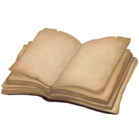
A second book art was created, this one with the book being open. This was designed to provide flexibility in case we decided that an open book looks better for the UI. However my new purpose for it is to show when the Player is interacting with the book and allowing the book sprite to change between open and closed in the corner of the screen.
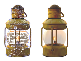
Worked on lamp art. The lamp was decided to be modeled like this as it prevents weird shadows when the light is implemented into the model in unity. Therefore it was expressed that a lamp with a more cylindrical and open look would be better. Also by making the lamp look old and used it creates a slight story to the character but also doesn’t distinguish a specific time period.
March 8th-14th
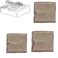
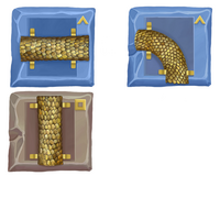
Snake tiles icons were designed and created because we wanted the player to be able to pick up and store multiple objects- including the tiles. I decided to draw them with a top down view to allow the player to easily distinguish what tile piece they are holding.
Celestial runes were also designed to give players more of a clue as to what level they were on. The runes were designed to be intuitive and visually basic. - Note this was changed later to fit the game aesthetic more.
March 15th-21st
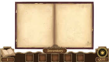
Designing the pause screen I decided to implement it into both the inventory and notebook screen. This design choice was to allow minimal searching on the screen during the game and making everything accessible with just one click. By doing this I needed to ensure everything was laid out cleanly and not overwhelming for the player.
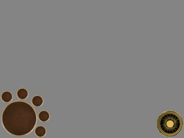
Early on in designing this game we decided we wanted this game to have minimal text and focus mostly on visuals and puzzle solving. We decided to push this theme by having explanations, lore and instructions/hints displayed in the players notebook. As a design choice, I decided that I wanted these to aesthetically look more hand drawn opposed to computer generated. I wanted the notebook and rune icons to remain in place on the bottom corners of the screen, this helps minimise searching by the players as there is familiarity in the placements. However in between these two icons I decided to display the inventory in a more stretched out manner opposed to being orbiting the notebook as seen in the in-game UI. I went with this choice to more clearly display the items held and also to create a banner at the bottom of the screen.
March 22nd-28th
With a stretched out banner for the inventory, I decided that it took up too much room to keep as the in-game UI. Therefore a minimised version was designed and created to be displayed in game. Keeping the Book and Runes on display as I believed this is all that is needed for the player, with minimised icons for the items collected.
The coding for the inventory and the main menu was also created and implemented.
March 29th- April 4th
Game art sprites were cleaned up and improved upon hearing feedback. This included fixing the glass texture for the lamp and adding texture and signs of aging to the lamp and books.
April 5th-11th:
To stop players from wandering off into the game world a particle system was created that would follow the player and up in intensity the further they strayed before eventually teleporting them back into the game scene. To fit the desert scene I wanted the particles to have a dust storm appearance, thus the particles were created in the Visual effects graph and implemented into the game.
April 18th
Main menu art was created, I decided to design it this way as it incorporates some of the main visuals in the game- the desert scene and snakes, with these two merging into each other alluding to the mechanics in the game.